


So, yeah, I’m a bit behind here. I fell off schedule a bit when my original subject for the journalistic portrait had to back out at the last minute. Thankfully, another friend of mine was willing to step up help me out.
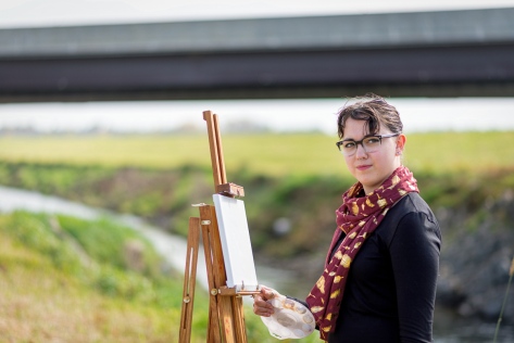 Mina is an artist in all forms. She’s a singer, dancer, actor, and painter. I’m quite fond of her artwork, so I asked her to bring along her easel and paint supplies. As varied as her creative outlets are, I decided I wanted to create a sort of juxtaposition in her portrait while still capturing the basic idea of her as an artist. She was kind enough to follow me down under this overpass in her high heels to set up her easel. I really enjoyed the way she was looking off in the distance — as if she was already planning her next project — and the location seemed to say she could make art out of any situation. (Nikon D600, 85mm, f/1.8, 1/1600s, ISO 100.)
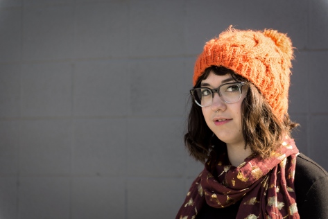 After hiking up out of Papio Creek, we spent the next hour or so driving around looking for somewhere we could pose her wearing her magnificent orange beanie. She showed up to the shoot wearing it, and I immediately wanted to use it in my color contrast shot. We ended up parking in the lot of Goodwill in La Vista, and set up shop. We ended up with a bit of an audience, wondering why we were doing a photo shoot in the back of the parking lot against the wall of the building. I ended up liking this more as an additional portrait rather than my color contrast shot, but I figured I’d share it anyway. (Nikon D600, 24-70mm @ 70mm, f/2.8, 1/640s, ISO 100.)
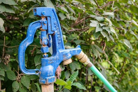 That left me with having to find another subject for my color contrast assignment. Thankfully, I was going through my photos from our visits to City Sprouts, and realized I already took one! There aren’t many hand cranked water spigots these days, and I remember the blue catching my eye among all the vibrant greenery in the garden. (Nikon D600, 24-70mm @ 50mm, f/5.6, 1/125s, ISO 400.)

I really love how you used 2 colorful items to create your color contrast photo. I also like how it is close up making the object easier to see. I feel like the green and the blue match up so beautifully, great job! I love it so much!
LikeLike